CIGO
A premium cigar advisor for a tobacco house: it reads a client's taste in seven questions, then hands back a short, justified trio. Taken from concept screens to a live, testable prototype, in two themes.
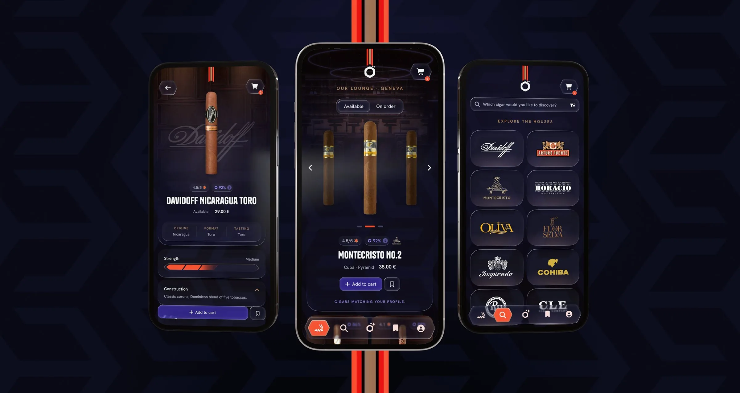
Overview
CIGO is a premium buying assistant, a mobile-first web app built for a tobacco house with a real culture of advice. It carries the tobacconist's advice onto a screen: understand a client's taste in a few questions, then recommend a short, justified selection, available at the counter or to order.
The client arrived with a Lovable build: enough to get the idea on screen, not enough on the design side, so a professional designer had to step in. The project then ran the whole chain: research and benchmark, product framing (PRD), art direction and key screens in Figma, architecture and flows, then a high-fidelity interactive prototype covering every screen, from the age check to the order confirmation, in light and dark. The design system came partially supplied; I adjusted it and made it functional for the UX-test PWA. Two client iteration loops followed, 24 feedback points integrated one by one. The cover and the concept visuals are the Figma key screens the test PWA was then built from, which is why the prototype's own screens read plainer than the concept.
The whole experience, from research to the interactive prototype
Every screen, the key Figma screens and a working prototype in two themes, delivered solo
Turned a tobacconist's advice into a product the client could test
The problem
Buying cigars online breaks the very thing that makes a tobacconist valuable: the advice. Hundreds of references and a technical vocabulary, vitola, wrapper, strength, finish, opaque to anyone but an expert, and catalogs that list without ranking. Nothing tells a client which one is theirs.
Research & approach
The upstream phase set the foundations. A benchmark of premium experiences, luxury retail and high-end product apps, fixed the visual and interaction bar. A product PRD framed the features, the recommendation model and the business rules: origin, strength, format, brands, duration, budget, availability. And an art direction set the register: an Art Deco chevron ground for a lounge mood, the house's hexagonal medallion, the logo as supplied, hung at the top of every screen, the color codes of classic luxury, an Hermès-style orange for every action, a violet kept for the client's own words, and heritage stripes running down the ribbon. Tanker, an editorial display face, over Hanken Grotesk. Four principles held it together: guide toward a choice, justify every recommendation, stay consistent and predictable, and keep it premium, sober and accessible, AA contrast, real touch targets, native scroll.
- Guide toward a choiceHundreds of references and an expert vocabulary: every screen guides toward a choice and says why, so the advice survives the jump to a screen.
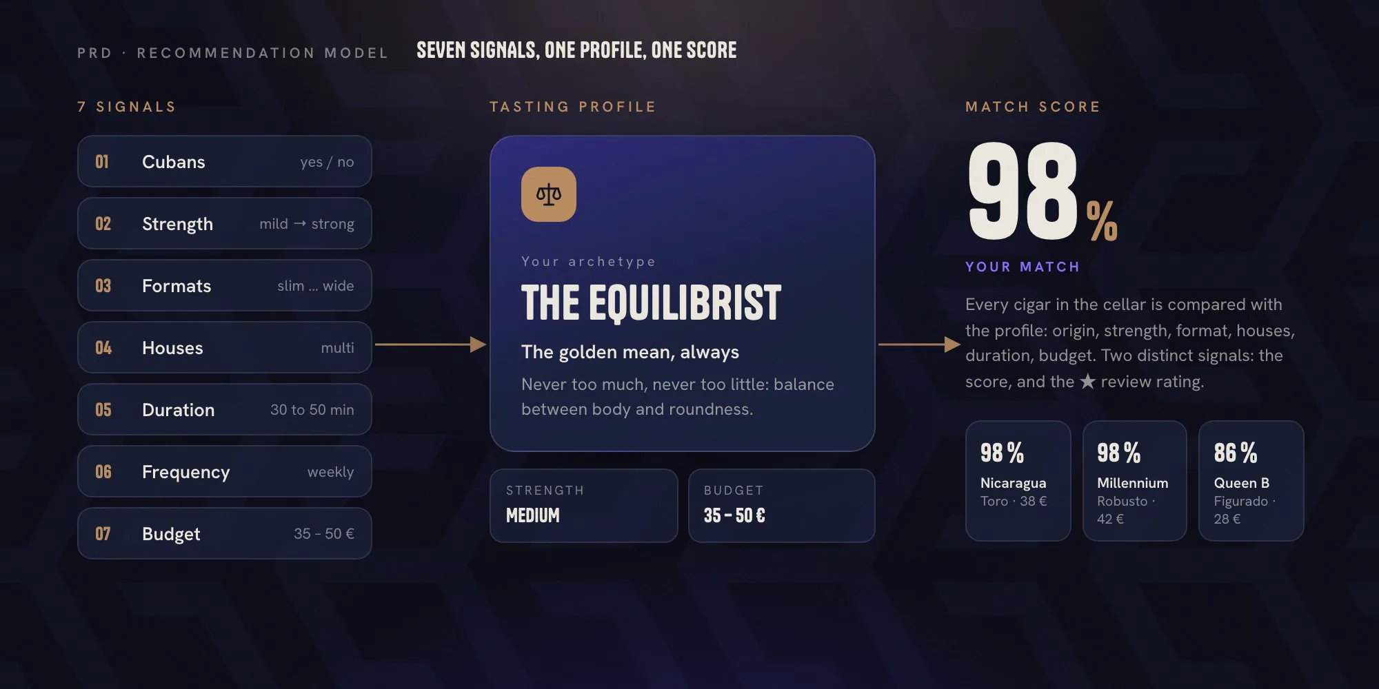
- Benchmark, then the PRDI studied premium references, luxury retail and high-end product apps, to set the standard, then wrote a PRD framing the recommendation model: seven signals in, one named profile and one computed score out.
- A lounge moodAn Art Deco chevron, the house's own medallion, classic luxury color codes and a single Hermès-style orange for action gave CIGO the feel of a lounge.
Flow
Onboarding is a conversation with the Advisor. The age check opens the thread, then two doors cover every profile: a guided quiz for the beginner, direct input for the amateur who already has names. Seven questions later, the client holds a named profile and a trio, before ever seeing a catalog.
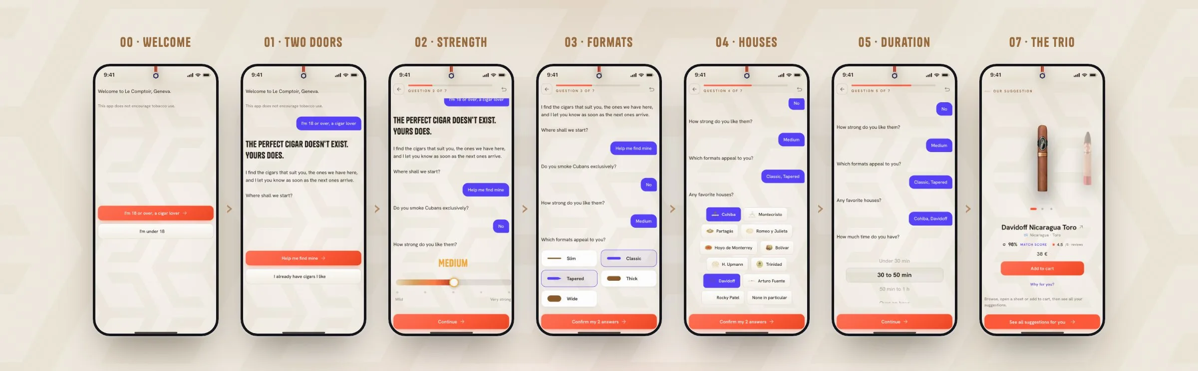
- One question, one custom controlAn ember gauge for strength, cigar silhouettes for formats, brand chips with their logos, an iOS-style wheel for duration and frequency, a gold gauge for budget. Each answer lands as a chat bubble, so the thread reads back like a conversation.
- Progress you can seeA fixed bar, "question 3 of 7", held through every transition, plus a back arrow on each step and a restart at the top. Nothing is trapped, and every answer stays editable before it counts.
- Account, laterThe e-mail is asked once the trio is on screen, framed as "so I remember your taste and tell you about arrivals", with a quiet "continue without an account". The value comes first, the form after.
Design decisions
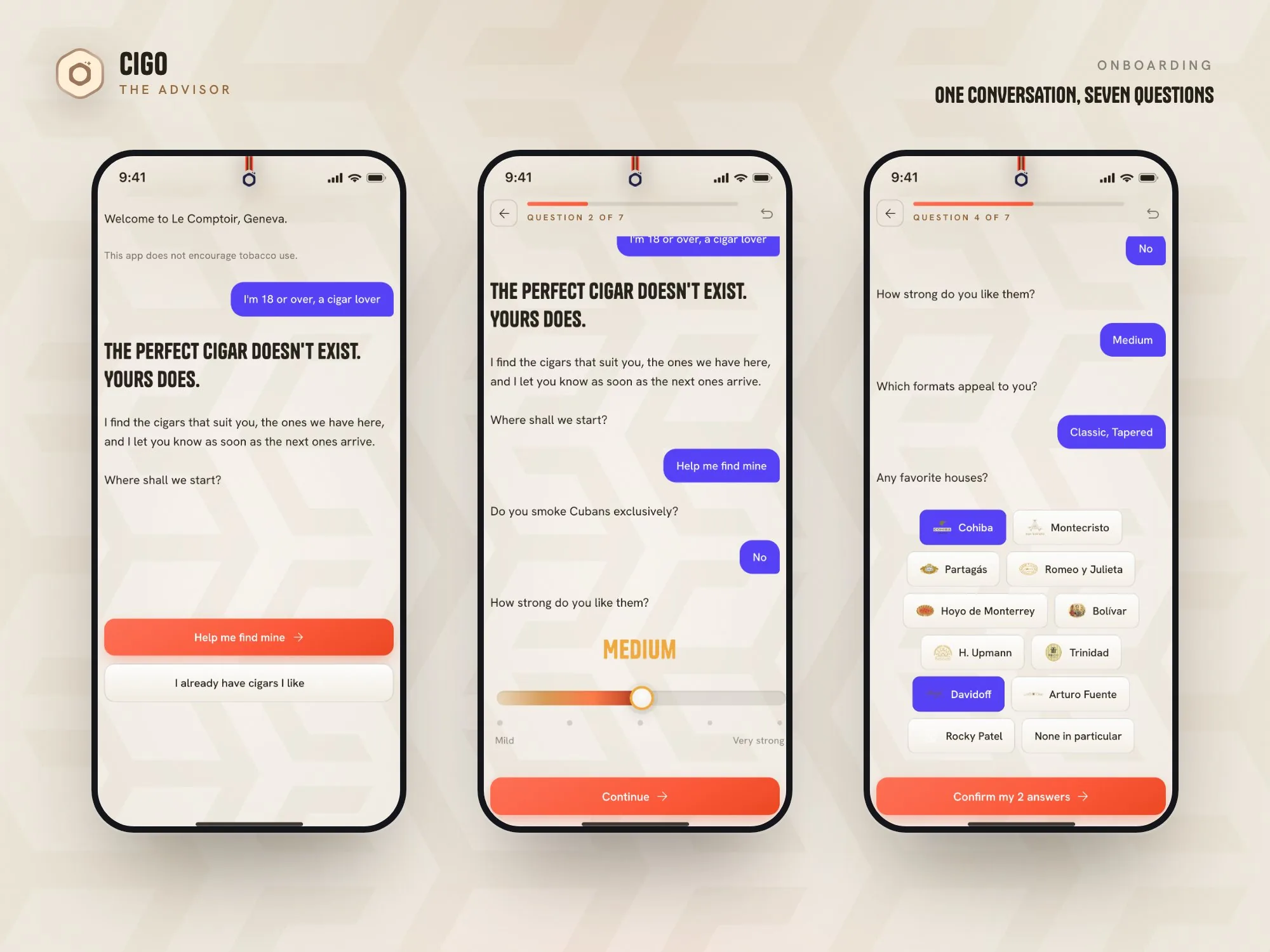
A conversation with the Advisor.
Activation runs as a chat thread with the Advisor. The legal age check is the first exchange, so the tobacco disclaimer opens the conversation. Two doors cover every profile: "help me find mine", a guided quiz, and "I already have cigars I like", direct input with the house favorites and voice dictation. The advice is felt from the first second.
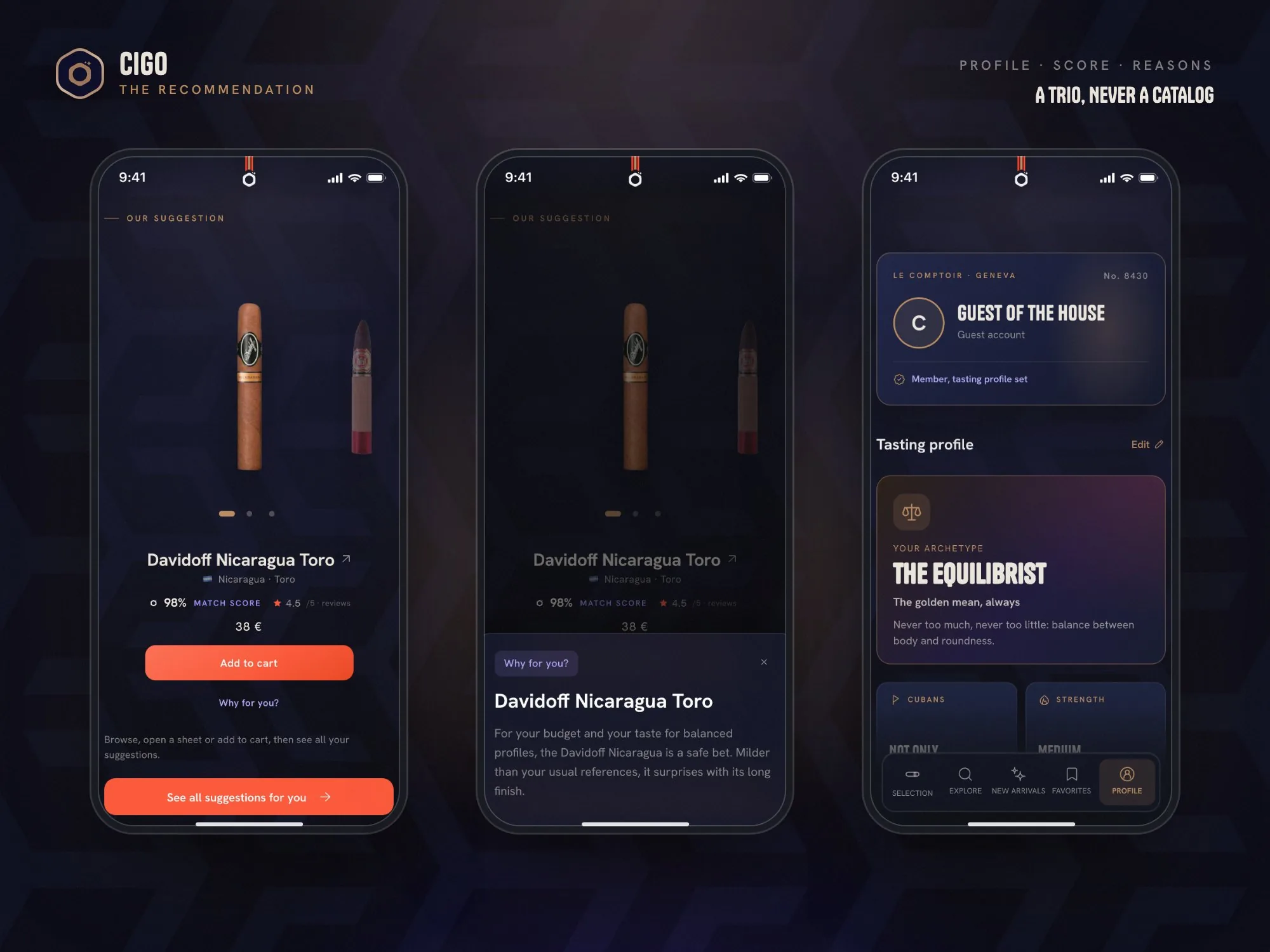
A named profile and a justified trio.
The quiz resolves into a named tasting profile, "The Equilibrist" for a balanced palate, and a trio: three suggested cigars, each with a computed CIGO match in %, explained on tap, "why for you?", and kept distinct from the ★/5 review rating. Two signals, never conflated. The client asked for the trio to be reworked in depth: browsable, tappable through to the sheet, add-to-cart in place, one CTA to see everything.
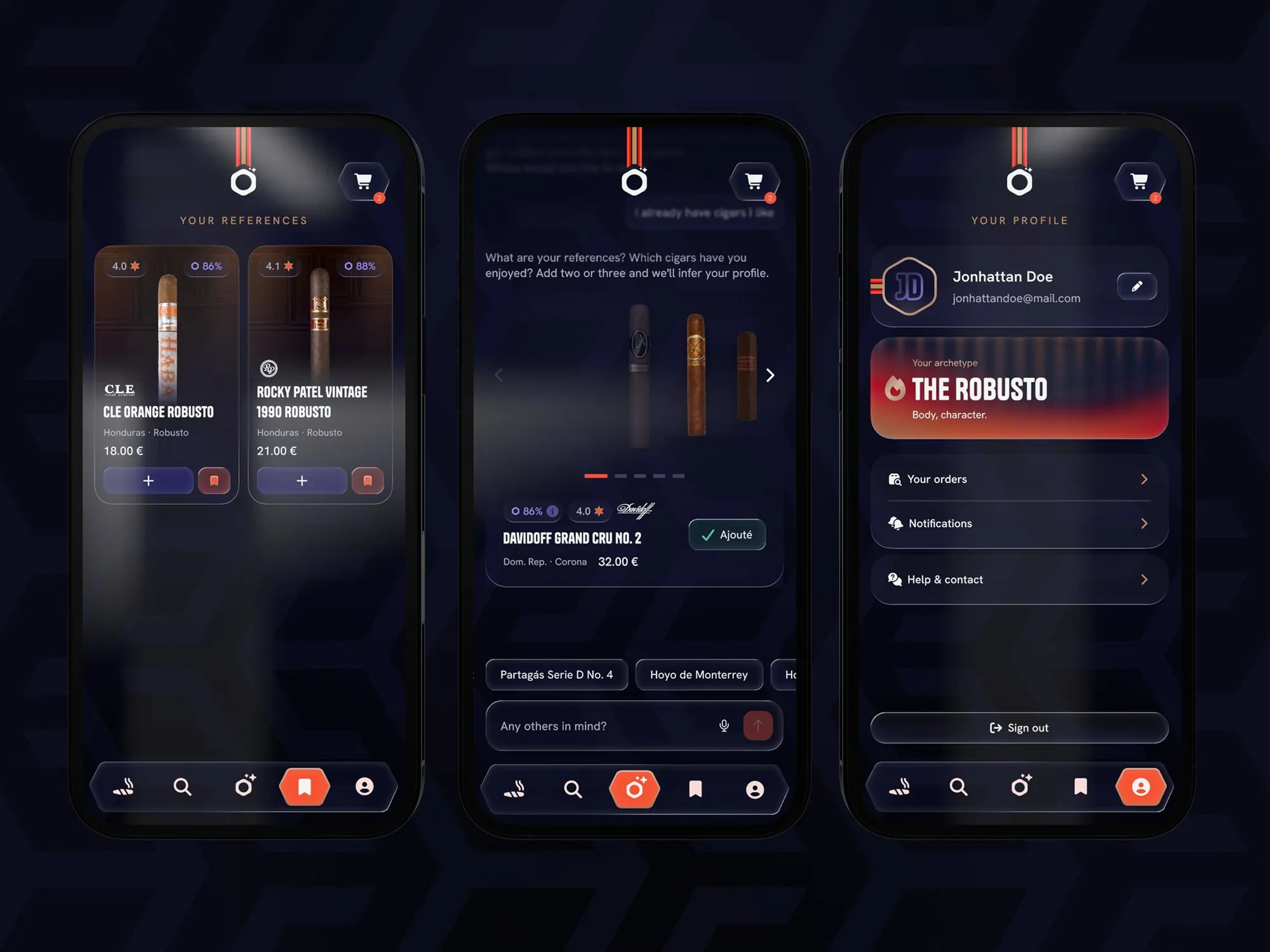
Key screens first, then make them work.
The styling was set in Figma before a line of the prototype: an Art Deco chevron ground for a lounge mood, the house's hexagonal medallion logo carried into the header, Tanker over Hanken Grotesk, classic luxury color codes with an Hermès-style orange for action, violet for the client's own words, heritage stripes on the ribbon, references carrying their match score, and a profile card that names your archetype, "The Robusto" on this screen, one of five that follow the profile. The design system came partial; I adjusted it, filled the gaps, moved the icons to Iconoir and made it functional for the UX-test PWA, in two complete themes, light and dark, so every screen could be tested in the hand.
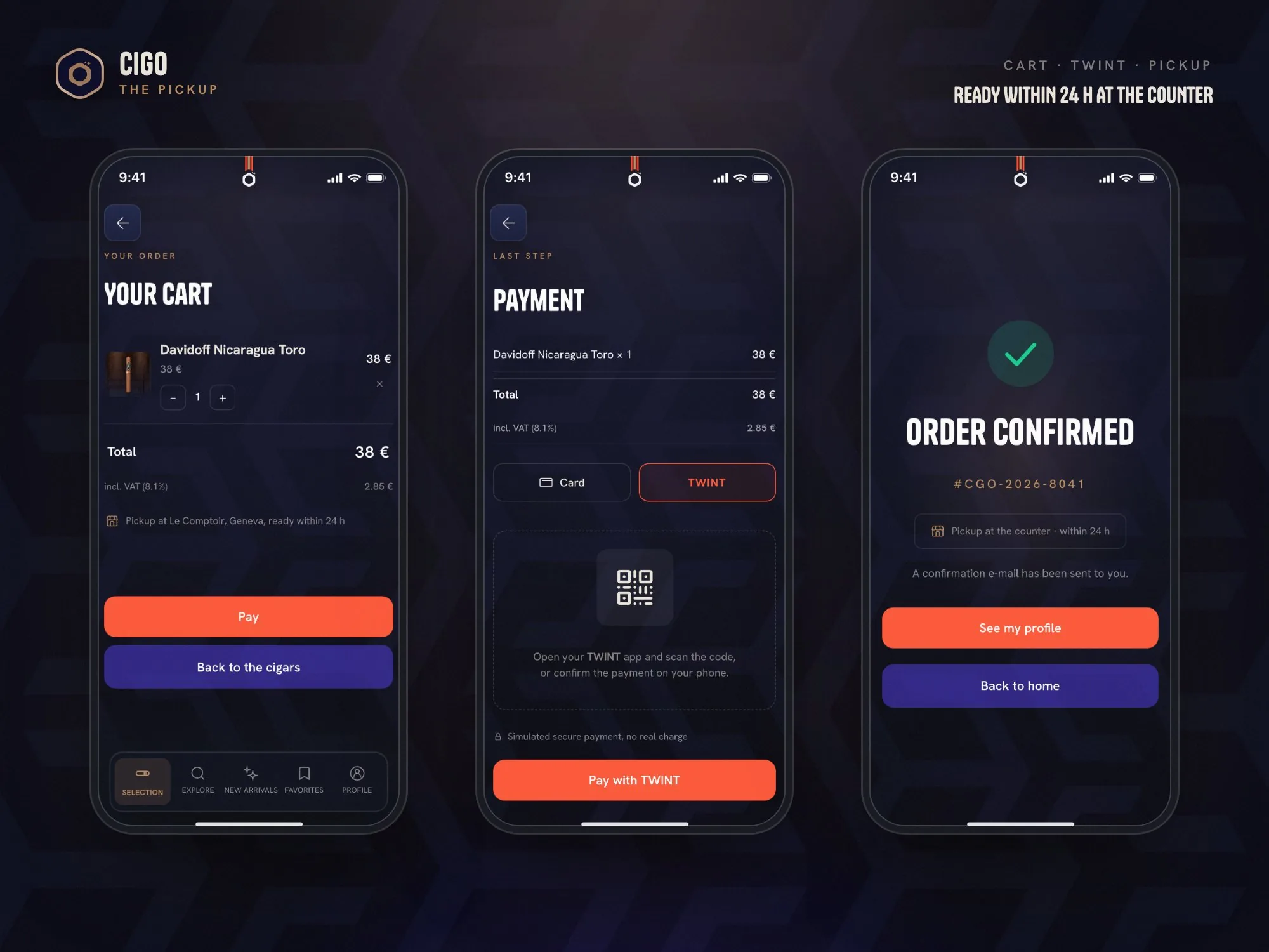
A cart built for the counter.
The cart is anchored in the local context: VAT at 8.1% shown on the total, card or TWINT, and pickup at the counter within 24 hours. Order confirmed, the client is sent back to the profile where the taste lives, so the loop closes on the advice.
The screens
The whole journey, high-fidelity and testable.
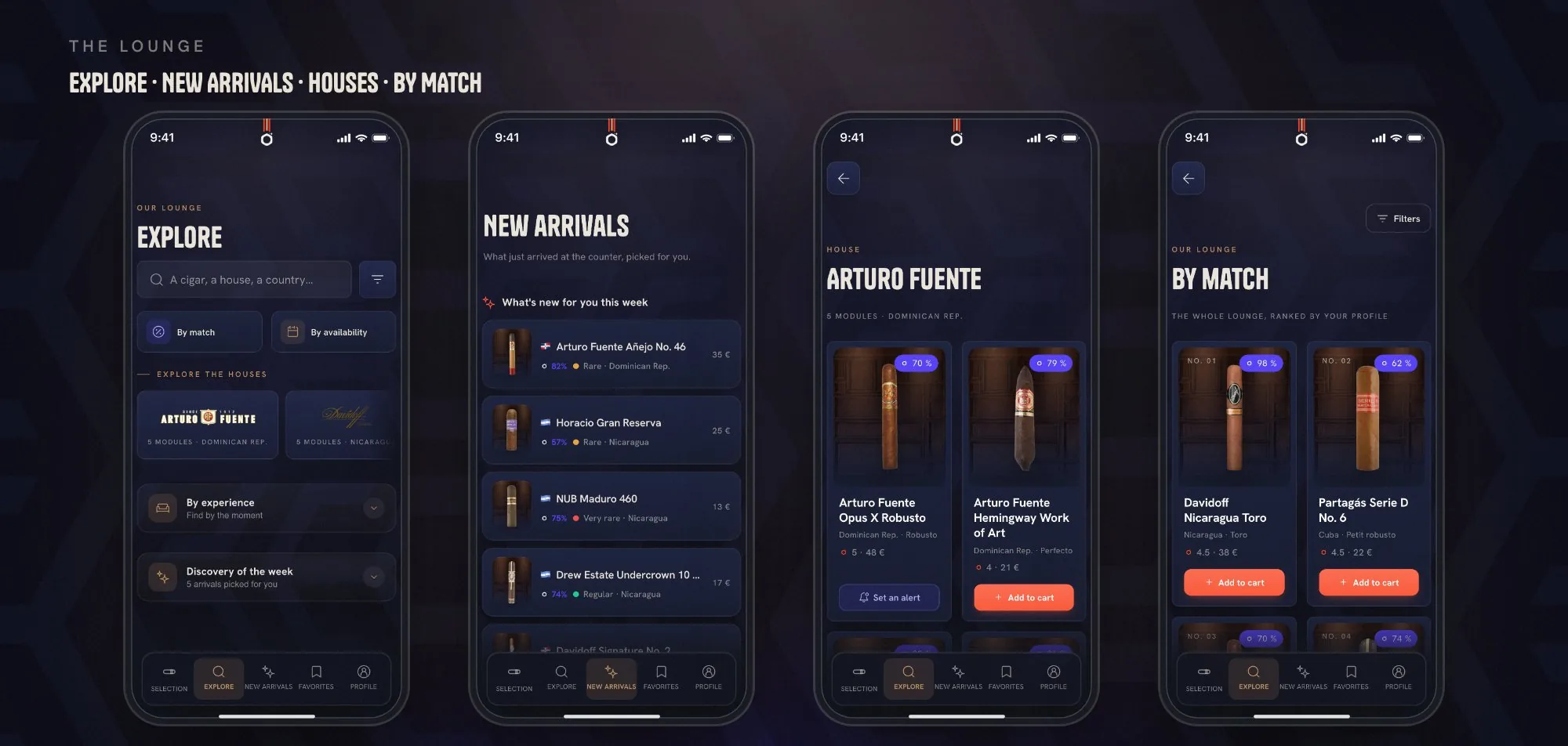
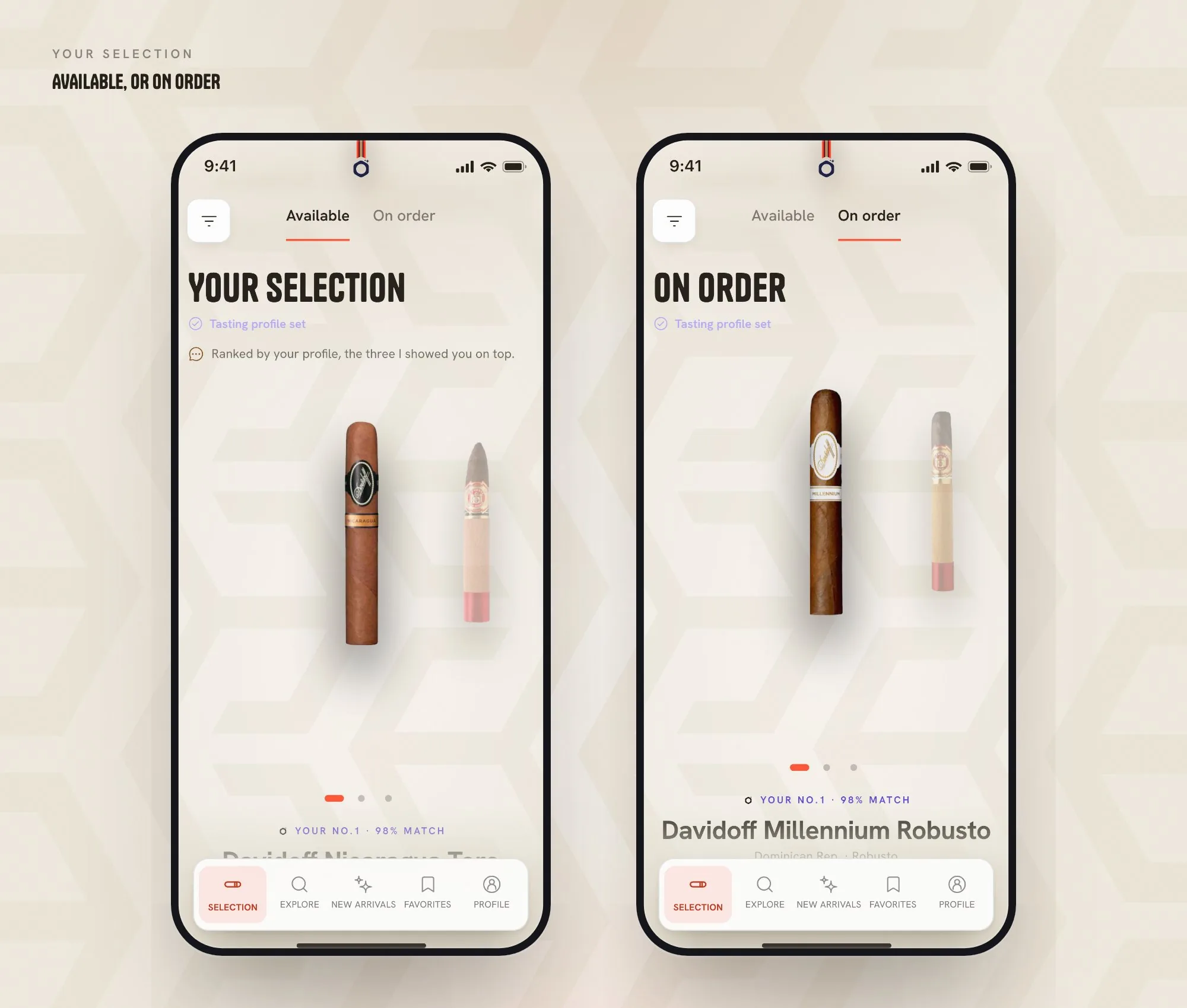
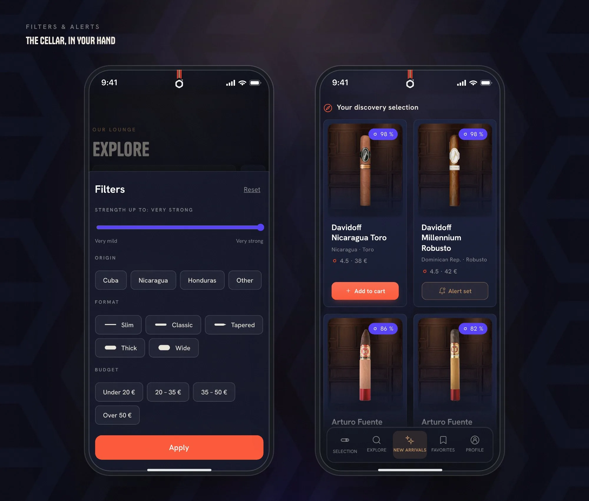
The lounge in five tabs, Selection, Explore, New arrivals, Favorites, Profile, plus the filters and the arrival alerts, in light and dark
Outcomes
A credible, testable prototype covering the entire journey, online and continuously deployed, with the full client feedback integrated point by point and a test protocol ready for real users.
The perfect cigar doesn't exist. Yours does, and CIGO is built to find it.